

Human beings are visual creatures – this is simply a fact of nature. When we see images, our brains store the details in two ways (one verbal, one visual), increasing our chances of remembering the information.
There’s a catch to this trend, though. People don’t recall decorative or arbitrary images well. Pictures with meaning, that illustrate facts or provide instructions, are much more easily committed to memory.
In his book Brain Rules, John Medina noted that people tend to remember only 10 percent of information they received three days ago. That is, unless there was a helpful image. In that case, people typically remember 65 percent of that information.
It probably doesn’t take much proof to tell you that people process information better when there’s a visual aid. Chances are, it was the colorful graphic at the top of this article that got your attention in the first place (kudos to Alissa Herman, the brilliant designer who created it).
So, how does graphic design fit into your marketing strategy, exactly? That all depends on what types of tactics you’re employing.
Let’s take a look at some of the most important marketing channels you’re likely using, and what role visuals play in them:
Branding
Before you build out your marketing strategy, start with the basics: your brand guidelines. Your style guide should be a starting point for creating every piece of marketing collateral that follows. Without it, it’s all too easy for your brand image and the tone of your communications to become inconsistent, making it much harder for your target audience to recognize your organization.
It’s never too late or too early to make a brand guide. If you’re already established, it can be helpful to create some rules to keep your communications aligned. If you’re just starting out, having brand guidelines from the get-go can reduce complications and inconsistencies down the line.
Brand guidelines are incredibly helpful to your graphic designer, whether you have an in-house professional or are working with an external agency. When first launching your business, work closely with the graphic designer to create a logo, choose colors, fonts and more.
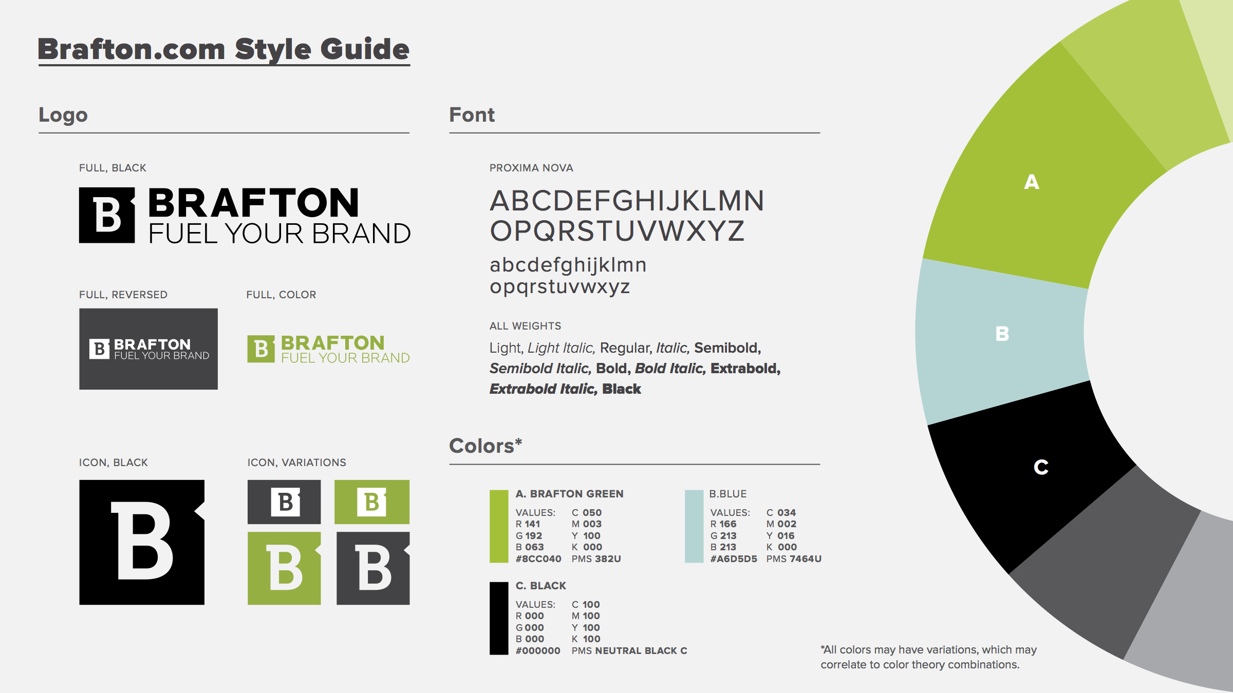
A graphic designer will have a good understanding of color theory to help you choose hues that don’t clash and also reflect the values of your industry. The same goes for typography; your graphic designer can help you choose fonts and typefaces that support your messaging.
Though they may seem like small details, colors and fonts can have a large impact on how your brand is viewed.
Consider a small legal firm. Clients walking into the legal firm seek sound advice. They need to know that the professionals at the firm are trustworthy and proficient at their jobs. If the firm’s logo is hot pink and neon green, written in bubbly, whimsical letters, those clients may second-guess the professionalism of the attorneys who practice there. Are they at their lawyer’s office or a beach party?
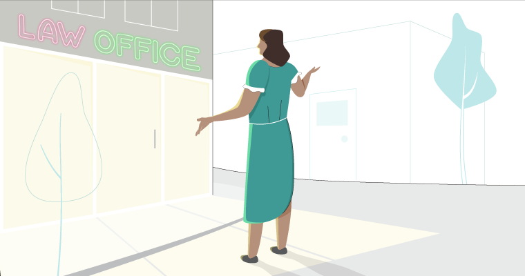
Instead, serene blue and gray tones will put forward an air of strategy, intelligence and seriousness. The typeface should be fairly traditional and easy to read.
Website
Your website is the virtual front door to your business. When visitors arrive, you want them to know that you’re the real deal, that you know what you’re talking about and that you’re trustworthy.
In a survey of 2,684 people, 46.1 percent said the most important determinant of website credibility was the design look, according to the Stanford Persuasive Technology Lab. By comparison, just 14.3 percent of respondents said the accuracy of information was a top factor.
Many things contribute to a good design look of a site. If it’s confusing to navigate, contains irrelevant information or the tone of the content doesn’t match the organization’s goals, these factors will detract from its credibility.
Images play a major role in a site’s look as well, but it’s critical to consider the purpose of each picture and graphic. People don’t like filler photos, and they don’t pay them much attention, either. Nielsen Normal Group eye-tracking studies found that people generally ignore pictures that serve no purpose, such as stock photos.
“When businesses first started using stock photography because they couldn’t afford real photography, it was a big deal,” Brafton Design Director Ken Boostrom explained. “But now people look at stock photography like it’s a plague.”
Nielsen Normal Group used an example of a Yale University School of Management page that describes the application process. The right side displays an image of students collaborating in a classroom. Though not technically a stock image, it may as well have been. The picture doesn’t add any new information about the application process. Not surprisingly, the group’s eye-tracking study showed that few people glanced at the image.
Yale could have added a different graphic that pertained to the information on the site. An infographic explaining a few nuances of the application process, or stats about prospective students like the average age or prior work experience of individuals applying may have been better served. Here’s a great example from The Common Application:

From Visually.
This graphic highlights interesting facts about the Common Application, which is used by many universities across the nation and globe. It also gives students hints about how they might approach their college applications. Students who may be wondering who they should ask for a recommendation will see that most people turn to academic advisors, while others approach teachers or counselors, for example.
Blog
Yes, your blog is a component of your website, but it’s used in a distinctly different way. This may be the entrance to your website for many users who find your company through a Google search. Also, unlike the rest of your website, which has static, informational pages, your blog is (or, at least, should be) regularly updated with new information that captivates readers’ attention.
And, as we know, great visuals are an effective way to do just that.
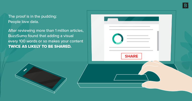
After reviewing more than 1 million articles, BuzzSumo found that adding a visual every 100 words or so makes your content twice as likely to be shared. But, there’s one important rule: The image must be relevant. Luckily, there are plenty of resources of curating appropriate pictures and graphics. You could add a GIF to illustrate your point (and entertain readers).
A quick GIF may be enough to break up the text and bring a visual appeal to your articles. But you can also use these moving images to illustrate a point or give instructions. Alex Chung, founder and CEO of Giphy, explained to PopSci that this brief form of communication can come in handy in a number of ways.
“We think it will be used for really practical things,” Chung said to PopSci. “Like, you get a cut and you think, ‘How do I stitch myself up?’ You can find a gif that will show you in five seconds what to do. The same goes for CPR, or the Heimlich maneuver.”
As far as your blog goes, your graphic designer can create a moving image to highlight an important point, making it much more memorable and shareable.
There are other impactful types of visuals to include. Nielsen Normal Group pointed out that information-loaded images do well, and data from QuickSprout backs up that claim. In an analysis of seven types of images, charts and graphs turned out to be the fourth-most shareable, after animated graphics, hand-drawn images and infographics.
Blog posts with charts and graphs also had the most trackbacks – 258 percent more than any other type of image, on average. People love data, especially when it’s broken down into one or two details at a time and decorated with attractive design elements. Which brings us to another valuable form of visual content: infographics.
Creating infographics can also be a boon to your blog. They have the potential to increase your site traffic 12 percent. A powerful infographic can take many forms, and what’s right for your audience depends on what you want to tell them and how you want them to respond. Flow charts, timelines, comparisons – the possibilities are limitless.
Of course, there are times when you want to represent data, but charts, graphs and infographics aren’t quite the right medium. At Brafton, we like using feature images that highlight a stat and provide a captivating image to match. They’re nice for breaking up the text, visually representing an important fact and make the article more reader-friendly. Plus, feature images work well for social sharing.
Social media
Facebook posts that include a graphic get 2.3 times more engagement, according to BuzzSumo. This is particularly important, considering 88 percent of respondents to Content Marketing Institute’s 2018 Benchmarks, Budgets, and Trends—North America report said Facebook was the most effective platform for helping them reach specific goals. But, again, there’s one simple rule to seeing this kind of benefit: relevance is key. Choosing any old stock image isn’t the way to win followers.
The same idea can be applied to Twitter. Tweets with images are 150 times more likely to be retweeted than those without. They get more clicks and favorites, too.
Short videos also perform well on social, and they don’t have to be particularly fancy to generate interest. In fact, the majority of Facebook videos are played with the sound off, meaning the audience is much more interested in watching the show than hearing it (provided there’s text to give the video context). Similarly, those informational GIFs that help boost your blog can also make great social posts.
Pinterest is another medium where great images perform particularly well. This may be a no-brainer, considering the platform is based on sharing images. But the effectiveness of Pinterest is worth detailing:
- 88 percent of pinners purchase an item they pin.
- 49 percent purchase 5 or more items they pin or repin.
- Shopify users referred by Pinterest spend $80 on average, but only $40 when referred by Facebook.
Pinterest is also a great platform for ecommerce ads. Online users today can typically spot an ad right away, and this is true for avid pinners, too. Even though they recognize an ad for what it is, they don’t seem to mind. If they like it, they’ll pin it just like anything else (and may even buy the item in the photo later on, too).
If there’s one thing every organization has in common, it’s a need for effective graphic design to propel their marketing and communications efforts. Beginning with strategic brand guidelines and following through into your website, blog, social media strategy and beyond, consistent and strategic graphics can support your messages and make your company more memorable.
You’ve heard that a picture is worth a thousand words, but how many impressions, engagements or leads can come from great graphic design? We think it’s worth it to find out.