

For as much as marketers love data, too much of a good thing is a … bad thing.
The more data you capture, the more unwieldy and siloed it grows. That is, unless you have a mechanism for integrating constituent data sets, structuring them logically and visualizing them beyond their ones and zeros.
That’s what Google Data Studio does, plus much more.
What is Google Data Studio?
Data Studio is a dashboarding and data integration tool that allows users to create visual, shareable analytics in a single repository. Reports are customizable, dynamic and interactive, so marketers can tell purposeful stories rather than simply repeat metrics to other stakeholders.
As part of Google’s comprehensive Marketing Platform, Data Studio is useful across a number of applications.
- It comes preloaded with many customizable templates.
- It aggregates multiple data sources, like Google Analytics, Google Sheets and Google Search Console.
- It allows you to feed in a new data source whenever you need to — because your data is always maturing and expanding into new fields.
- It has drag-and-drop functionality and an easy interface for even the least tech-savvy among us.
- It has dashboarding features that executives and business leaders love, so you can create a panoramic visualization of your campaigns. No more having to share several slide decks or repurpose data for other stakeholders — relevant parties can pull from and interact with key metrics and analysis that pertain most critically to them.
- It works for any channel. It’s not just an SEO dashboard — KPIs from a Google Ads campaign, for example, can sit side by side with inbound metrics like organic traffic.
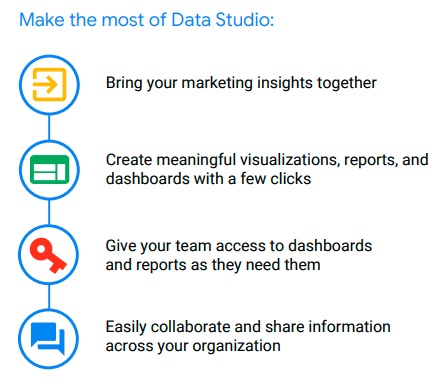
Here’s how Google explains the practicality of a Data Studio report:
Starter Google Data Studio templates
Every marketer has their go-to preference for templates — and even font, gradients and indentation. I’m partial to a size 11 Georgia font with darker, matte background and a top-justified alignment. That’s just me, though.
Your Data Studio template can start from a complete blank slate or from a reporting template that aligns with your goals. You can browse the full range of free templates in the Google Data Studio Report Gallery.
Here’s a quick snapshot of what to expect:
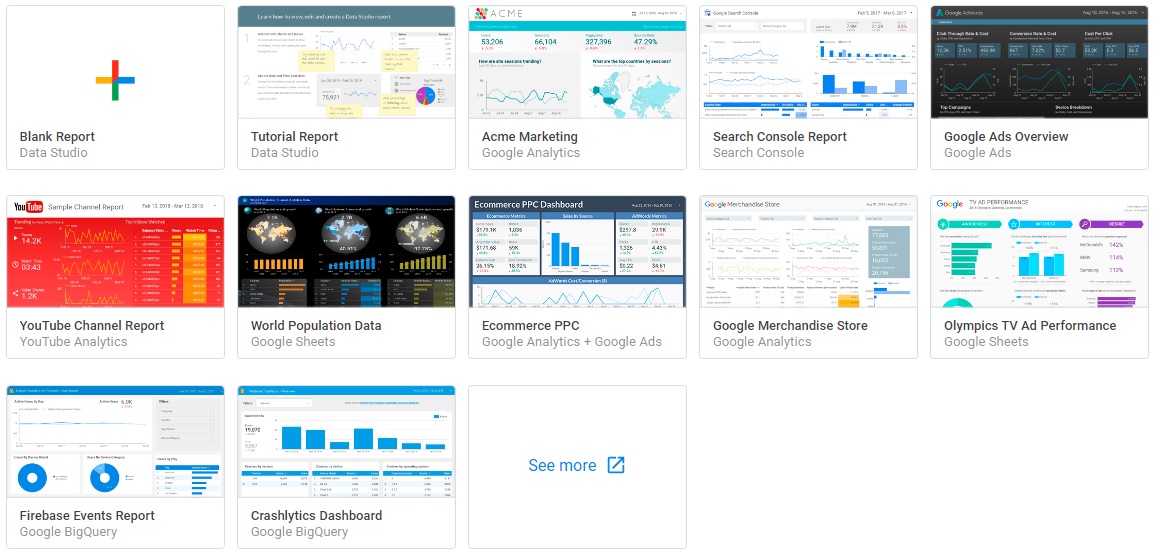
As you can see, most of the preconfigured templates are best-suited to specific marketing functions: a report on YouTube or ecommerce performance, for instance. This is a useful launchpad, as Google Data Studio also allows you to create “Pages,” which are essentially the equivalent of a “Tab” in Google Sheets.
You can toggle back and forth between different pages depending on what you want to visualize and to whom each specific report is geared toward. It ends up looking like a flipbook.
The benefit is that you’ve now consolidated all of your campaigns and data sources into a single source, instead of having to log in and out of Google Search Console or presenting another Google Slide. That data all feeds into the same place.
Additionally, you can create a master dashboard that includes widget aggregates of your individual pages. This is effectively the “front page” of your reporting template, so it should ideally be highly compact, vibrant with color and immediately clear which metrics you’re presenting.
Here’s a sample report in a column format, using a Google Sheets data source and with visually rich components. This dashboard gives me all the information I need on this topic right up front and includes multiple ways to analyze the data (geographically on a globe or statistically on a bar chart).
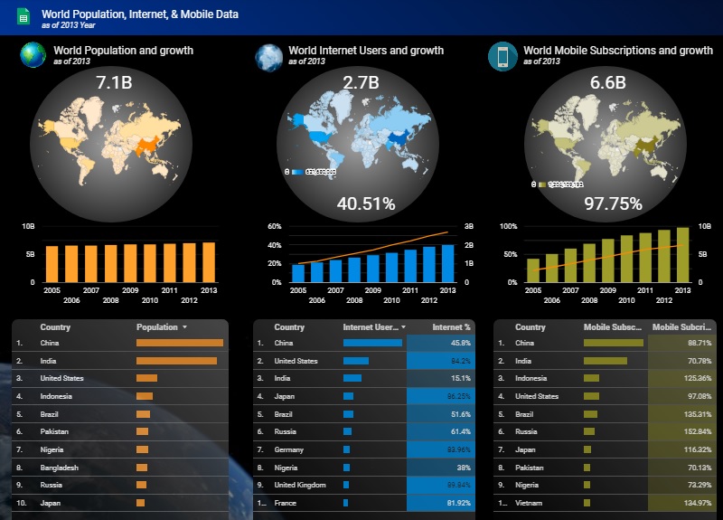
This is a more sophisticated visualization, and obviously for a global brand. So, smaller organizations with fewer data sets might not have data that’s as exhaustive as many of the templates display. In case that you find Google Data Studio complicated, or there is no integration with your data analytics tool, you can always configure data visualization using some of the powerful Google Data Studio alternatives.
How do you set up Google Data Studio?
Data Studio is free to run.
As long as you have an existing Gmail account, it’s already available to you as part of the Google Marketing Platform.
You immediately gain access to the entire gallery of templates and integrations, so the actual manipulation and management of your dashboards is incumbent upon you connecting your data. From there, Data Studio is what you make of it.
Users that leverage Data Studio to its full effect often do so for big-picture digital marketing campaigns in collaboration with any channel partners or internal stakeholders. There’s room for sales data, customer data, web analytics and much more — so colleagues from multiple departments can make use of Data Studio.
Google Data Studio reporting features
Because Google Data Studio is highly customizable, you might be struck with decision paralysis. There are so many widgets, drop-downs, metrics formats and insert options that, unless you have a strong background in data analysis, you might not be sure how to proceed at any given moment.
Some of the common features you’re most likely to encounter are:
- Bar or pie chart.
- Table or pivot table.
- Time series (date range).
- Scorecard.
Within each data set, you can also configure custom filters, parameters, dimensions and fields — similar to what you may be familiar with inside your Google Analytics account.
Because most integrations with Data Studio (especially from other Google properties) will preemptively migrate the structure and logic of your original data set to your new dashboard, you might not need to do much more tweaking. However, if your organization has lots of unstructured data stored in Google Sheets, you’ll have to do a bit more work to make your report template sensible.
I learned this the hard way.
Any type of Google Sheets data is best organized vertically, not horizontally. Google — and any software, really — prefers a “tall not wide” data structure. This means fewer columns, more rows within Google Sheets.
A structure like this allows Google to properly connect your data and represent it clearly. So, plan to pre-structure your Google Sheets before you build any of your dashboards.
Which types of data can be used in Google Data Studio?
An important factor to consider — which may not be immediately evident — is that any data source that feeds into your Data Studio dashboard needs to be either:
- From another Google product.
- Integrated from a third-party source.
For example, in addition to GA, GSC and Google Sheets, as mentioned above, other Google products might include:
- Google Ad Manager
- BigQuery.
- Google Surveys.
- YouTube.
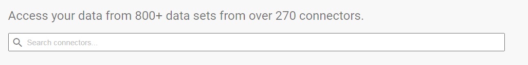
Non-Google properties can still be pulled into Data Studio, and there are more than 270 “partner connectors” at your disposal, such as:
- Adobe Analytics.
- AdRoll.
- Ahrefs.
- Bing Ads.
- Campaign Monitor.
Luckily, you can just use the native search bar to find integrations.
Each data source can be combined with others to create a “blended visualization.” Here’s how that’s done:
Template your success
Google Data Studio is only as useful as your data. If you’re not properly tracking or storing important sales and marketing data, you’ll have nothing to populate your reports.
So, organize your spreadsheets, set up tracking codes within your web analytics accounts and connect your data sources in time for your next company presentation. Everyone loves a dashboard!


