

You’ve probably come across a few brands that seem to nail it with their graphic design, every single time. From social media carousels to long-form white papers, their graphic deliverables appear effortlessly cohesive. How do they make it look so easy, while you’re facing workflow bottlenecks and creative blocks?
The truth is, incredible design work doesn’t just happen for some people and not others. Every successful designer follows a tried-and-true graphic design process they know will help them achieve results — and you can, too, especially if you incorporate design thinking into each phase of your project.
We’re demystifying the creative process to show you design principles that work. By the end of this article, you’ll have a comprehensive introduction that graphic design professionals can turn to whenever they need to revisit the fundamentals.
What Is the Graphic Design Process?
Graphic design is a critical visual communication tool marketers use to convey key messages about a brand. It’s all about producing visual assets that are eye-catching, on-brand and aligned with specific messaging. When it comes to user experience in design, the impact of well-executed graphic design cannot be overstated, as it directly influences how users interact with your brand.
The graphic design process, then, is what a designer follows to bring design ideas to life while serving a client’s end goals. This process often involves using tools like Adobe Photoshop to create and manipulate design elements, ensuring that the final design is polished and professional. A clear process or graphic design framework helps you decide which tool is best for each task.
Designing graphics involves equal parts of “creative” and “process.” In other words, a graphic designer will adhere to logical, step-by-step procedures all the way to completion. Creative ideation and original design work fit into this process — but they’re not the only skills or considerations that result in successful design. The graphic design process involves a great deal of communicating, critical thinking and problem-solving, too.
Subscribe to
The Content Marketer
Get weekly insights, advice and opinions about all things digital marketing.
Thanks for subscribing! Keep an eye out for a Welcome email from us shortly. If you don’t see it come through, check your spam folder and mark the email as “not spam.”
The 13 Essential Rules for a Successful Graphic Design Process
Before diving into the actionable steps that drive a successful graphic design project, it’s important to understand the key rules and principles that underpin every effective design. These rules are not just guidelines — they’re the backbone of a process that ensures your creative work is purposeful, strategic and impactful.
Below, you’ll find the essential rules to keep in mind as you embark on your next graphic design project. Each rule will help you stay focused, consistent and aligned with your goals and your audience.
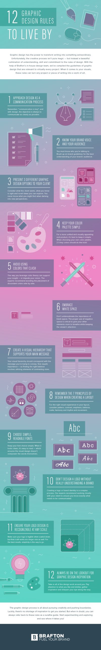
1. Approach Design as a Communication Process
Graphic design is more than just aesthetics; it’s about communicating a message clearly and effectively. Every design decision should be rooted in the purpose of conveying information to your target audience.
2. Know Your Brand Voice and Your Audience
Before starting any design, brush up on the brand guidelines and understand whom the design is for. A deep understanding of your audience ensures your visuals resonate and support your brand identity.
3. Start With a Solid Creative Brief
A clear creative brief is the foundation of a successful project. It should include company details, goals, audience, deliverables, timeline and budget.
4. Keep Your Color Palette Simple
Limit yourself to 2-3 key colors for a clean, cohesive look. A well-chosen color palette helps reinforce brand recognition and keeps designs from feeling cluttered.
5. Use Consistent Typography
Choose fonts that reflect your brand’s personality and are easy to read. Consistency in typography across all assets creates a unified brand experience.
6. Balance Visual Elements
Maintain equilibrium between text, images and white space. Balanced designs are visually appealing and easier for users to navigate.
7. Establish Visual Hierarchy
Guide viewers’ eyes using size, color and placement to prioritize key information. Visual hierarchy is crucial, especially in assets like an infographic, where clarity and flow matter most.
8. Use High-Quality Images and Graphics
Always use sharp, high-resolution images and graphics that align with your brand and message.
9. Prioritize Readability
Remember that most design work is text. Use clear fonts and sufficient contrast between text and background to ensure content is easy to read.
10. Be Consistent Across Platforms
Consistency in design elements, colors and messaging builds trust and recognition, whether on social media, your website or printed materials.
11. Test and Iterate
Gather feedback from stakeholders and your target audience. Use their input to refine your designs and improve outcomes.
12. Stay Inspired and Keep Learning
Look for inspiration in other designs, trends and resources. Experiment with new techniques and continually update your skills. For more inspiration and tools, check out The Top 9 Branding Tools To Use When Marketing Your Business.
13. Accessibility & Best Practices
Design with accessibility in mind to ensure your work can be enjoyed by all audiences. Use sufficient color contrast, readable font sizes, alt text for images and logical navigation. Following accessibility best practices not only broadens your audience but also demonstrates your commitment to inclusive design.
The Graphic Design Process in 6 Steps
Whether you produce the graphics for an in-house marketing team or you’re a graphic designer serving a big book of clients, you and your collaborators will benefit from a clear production and approvals process. No matter how skilled you are at creating visuals, refining your graphic design process and leveraging graphic design services can streamline cross-team workflows and help you arrive at a more successful end result, faster. Think of the steps graphic design professionals follow as a roadmap to consistency.
Here’s how to turn a concept into a compelling visual communication tool, from the creative brief to the finished product:
1. Build Out the Creative Brief
Before you get going with digital drawing tools, the first step in your graphic design process should be establishing the creative brief. Also called a design brief, this document will capture all of your client’s wants and needs and other key project specifications.
Anyone who wants to work with a graphic designer should be able to articulate what they’re looking for and what goals the design asset needs to meet. You may receive a complete design brief from your colleague or client. Or, you may be the one asking questions and filling out the brief.
Either way, your creative brief should address:
- Company information (e.g., mission, offerings, unique value proposition).
- Brand guidelines.
- Target audience.
- Asset type (e.g., logo design, UX design, eBook design).
- Purpose of the asset and how it fits into the overarching marketing campaign.
- Initial design concept or creative direction.
- Production-related design specifications.
- Delivery format and file type.
- Project timeline, with key milestones.
- Budget or cost of the design work.
Review the project intake form with key stakeholders to ensure everyone is on the same page. It may take a few tries to make your brief as clear and comprehensive as possible, but investing the time here prevents confusion in later process steps.
When establishing the timeline, make sure you’ll have the final copy in your hands before you start designing. Any changes to the text could set you back significantly. After all, you don’t want to end up putting together a clever infographic design only to find out half of the data points will be thrown out and rewritten! Since form follows function, it’s essential to lock in any text you’ll be using before it ends up in the design asset.
2. Research the Design Ecosystem
Now that you know your creative mission, it’s time to start your preliminary visual exploration. During the research stage, spend time:
- Understanding the specific product or service you’re representing.
- Examining competitors’ design work.
- Assessing your brand’s market positioning and differentiating qualities.
- Exploring other visual content your target audience consumes, beyond your niche.
- Considering how you might apply color theory and design trends.
- Gathering inspiration images and building out a moodboard.
Research is an important part of what a graphic designer does. You’ll use your findings to inspire original ideas, solidify the overall design approach with other stakeholders and back up the design decisions you make later on. This stage is where the design thinking process really begins to take shape as you synthesize your research into actionable design principles.
3. Develop and Refine the Graphic Design Concept
Armed with your design brief and a wealth of information from the research process, it’s time to start building out the framework for what the asset will ultimately look like.
Depending on what you’re working on, the concept development and refinement stage may involve sketching out thumbnails, mockups or graphic elements. Larger and more significant projects may require more fine-tuning and several iterations before moving into production. This is where principles and graphic design guidelines — such as balance, contrast and emphasis — shape every decision.
Regardless of your project’s scale, it’s important to present your initial concepts to the rest of the team. A good graphic design rule of thumb is to pitch 3 ideas:
- Provide exactly what the client asked for.
- Offer your interpretation of what you think they’ll like, based on everything you know.
- Pitch a new concept or idea that could still meet the brief.
Have your client or colleagues pick one of the three, and continue refining it. Ask for feedback about your general approach and the rough framework for your project to see if anything is missing or should be tweaked to better support the ultimate project goals. This way, you won’t spend all your energy and time designing down the wrong path. Many design experts refer to this as the “diverge-converge” loop.
During this stage, you might use Adobe Illustrator to create vector-based graphics, ensuring that every visual element is scalable and versatile for the final product. The rough sketch you start with will evolve, and through brainstorming with your design team or design firm, you will develop a comprehensive visual language for the graphic design project.
4. Create the Design
Once all stakeholders are in agreement and you have all that you need to proceed with the design, it’s time to execute the project.
During the design stage, a graphic designer will implement best practices related to the use of color, typography, the hierarchy of information and positive and negative space. They’ll also put technical skills to the test, using the right graphic design software and other applied productivity tools to get the job done in the most efficient way possible. For instance, Adobe Creative Cloud offers a suite of applications that can streamline the graphic design workflow and provide an array of tools for different design needs, whether it’s UI design for an app or package design for a new product. Tools like Photoshop and Lightroom enable powerful image editing capabilities.
Before sending off your design, conduct a self-critique and examine your work with an editing eye. Are there any design elements that seem out of place? Does your visual hierarchy support the goals outlined in the creative brief? This is the time to make any edits of your own — but this isn’t the end of the revision process.
5. Collect and Implement Feedback
The feedback stage involves a series of smaller steps that ensure quality control and perfect alignment with your stakeholders’ vision.
Depending on what type of team you’re working with, this part of the graphic design process may look something like this:
- Submit the design work for internal review.
- Make any requested changes.
- Present the updated design to your client or other decision-makers.
- Explain how your design decisions align with the creative brief and the direction you agreed on.
- Gather feedback from all stakeholders.
- Confirm your next steps.
- Make the requested changes.
- Present this new version to the rest of the team.
From there, rinse and repeat until there are no outstanding change requests. Remember, client feedback isn’t a roadblock; it’s a core part of the design principles graphic professionals live by.
The feedback stage is also where web developers and other stakeholders can weigh in on the usability and effectiveness of the design, ensuring that the final product isn’t just visually appealing, but also functional and user-friendly.
6. Finalize and Deliver the Design Assets
Now that you’ve gotten final approval from all stakeholders, you’re ready to deliver the assets in the appropriate formats. Through careful design task management, you can ensure that all deliverables are packaged correctly, meeting the specified requirements and avoiding last-minute issues.
Your creative brief should articulate what deliverables you should share. For instance, you should make sure to send the asset in the correct file types and sizes so no changes are needed later on. Helping your recipients avoid the hassle of modifying the files or asking for further support can make for a better design experience for everyone involved. Many teams also provide a compressed ZIP folder to make downloading each final product easy for busy stakeholders.
How Following a Graphic Design Process Drives Results
Graphic design and marketing go hand in hand — and generating marketing results isn’t easy without a solid strategy in place for communicating across teams.
Once your creative brief is approved, this serves as both instruction manual and contract for this particular design project. Some designers even keep a laminated copy at their workstation as a quick reference for every design process step.
Additionally, using a design brief and following an agreed-upon feedback and revisions process helps with managing the expectations of key stakeholders and collaborators. If there’s any question of whether you delivered on time or on brand, you can point back to the goals and specifications outlined in the creative brief and show how you met them.
Listening closely to client feedback and making the necessary updates can help you become a better graphic designer. For instance, you might think of clarifying questions to ask during the design brief stage. And you’ll get better at translating abstract feedback into actionable design edits. Over time, you’ll also learn which graphic design tips resonate most with different audiences and which principles graphic strategies drive the strongest engagement.
Graphic design is a critical component of your marketing strategy, so following a consistent process is the first step toward success. By adhering to this process, you’re more likely to achieve a better design that resonates with your audience and fulfills the project’s objectives.
Editor’s Note: Updated June 2026.