

Not everything can be improved by adding motion. For example, it would probably be best if your dinner plate remained stationary while you’re chowing down.
The marriage of animation and infographics, though — that’s the equivalent of a reservation at a scenic revolving restaurant for you and your target audience.
What Is an Animated Infographic?
An animated infographic is a video, GIF, interactive landing page or any other media format that allows you to visualize data for your audience while incorporating motion. These visual content pieces may be used to interpret qualitative or quantitative information, and they can even leverage voice-overs as well as other audio elements if desired.
There are many different types of animated infographics. Some take the same format as traditional static infographics while integrating just enough animation to hold the audience’s attention a moment longer. Others are video-based visual representations that may involve original footage, moving illustrations, music and custom transitions.
Why Should You Use Animated Infographics?
Infographic videos and GIFs give you an opportunity to improve the visual appeal of your marketing assets, hopefully providing a boost to your conversion rates at the same time. Videos and eye-catching motion graphics are also ideally suited for distribution on social media. They’ll encourage your readers to pause while scrolling and to hopefully go one step further by sharing the content.
Animated infographics also provide a new avenue for presenting information in a way that appeals to a wider variety of learning styles.
How Are Animated Infographics Different From Traditional Animation Videos?
In the marketing field, traditional animated videos can tackle a wide variety of different topics. Animated infographics are defined mostly by the purpose they fulfill and the kinds of information they convey.
Often, businesses will use traditional animation videos to provide quick, generalized product demos or to illustrate case studies and testimonials. Short explainer videos introduce a brand’s value proposition and may highlight specific products or service offerings.
Animated infographics sometimes overlap with animation videos, but they can take other forms as well, such as GIFs or landing pages. Infographic animation can take the form of simple motion elements added to an otherwise static image, like gears turning or numbers counting up.
Animated Infographics vs. Other Types of Visual Content
Animated infographics fulfill objectives that are associated with content marketing: They provide valuable or interesting information in a visual format that incorporates motion.
Other visual assets may prioritize persuasive advertising techniques, or they might deliver value by being highly interactive — like calculators or augmented reality (AR) environments.
Interactive infographics incorporate animation based on user activity. This can be as simple as a cartoon motion that’s triggered by scrolling down the page or as complicated as highlighting information and pathways that the user wants to focus on.
As a form of content marketing, animated infographics may support a brand’s social media strategy. Marketers engineer animated experiences that are frequently designed to be shared. They’ll pay to air a 30-second TV spot, but they’re hoping the animated infographic they’ve created is interesting or entertaining enough that their audience will do the hard work of distributing it for them.
How Does Motion Improve the Impact of Infographics?
Even without the extra oomph that you get from animation, infographics drive results. Time and motion unlock a fourth dimension for these otherwise 3D visual aids.
At a bare minimum, animating your infographic makes it more visually appealing. At best, motion unlocks new horizons of perception and understanding.
Take distancetomars.com as an example. It starts out looking like a simple and straightforward static infographic:
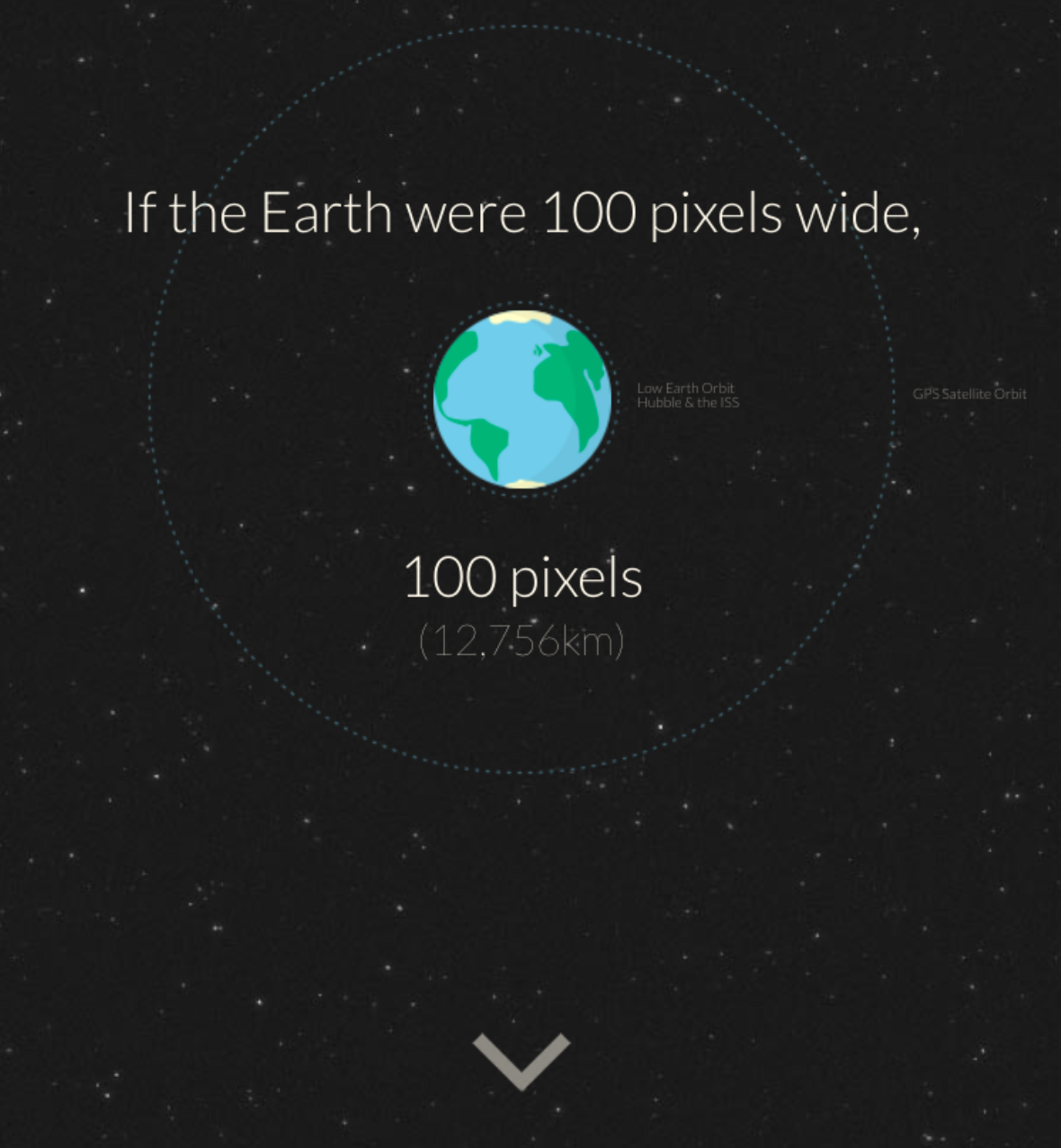
Once you click the downward-facing arrow below Earth, things change. The website scrolls down to the moon, a sizable distance away. The real fun happens when you click down again, though. Then, you’re off to Mars.
Suddenly, the effect of elapsed time takes hold. While the page continues scrolling, you see nothing but small dots passing you by, simple illustrations of distant stars somewhere across the universe. Though text appears on the page revealing that you are essentially traveling at three times the speed of light, you still have to wait for almost an entire minute before you reach Mars.
Through the experience of time and motion, you have a whole new understanding of the vast scale of outer space.
What Makes a Good Infographic?
As we’ve seen, video isn’t the only way to make a compelling animated infographic. So if flashy visual effects aren’t necessarily the key to an exceptional infographic, what is?
Good infographics:
- Are based on interesting or useful data and information.
- Leverage visual elements to enhance the presentation of that information.
- Support a unifying theme.
Of course, a little bit of pizzazz helps, but it shouldn’t come at the expense of delivering what your audience wants in a format that’s easy to understand. A slick illustration isn’t going to make up for bad data or sloppy organization. When in doubt, go high on the concept and simple on the design.
Effective animated infographics also focus on delivering the types of information that translate easily into visual formats, such as:
- Statistics.
- Survey results.
- User data.
- Trends, arcs and bulleted themes.
6 Animated Infographic Examples and Takeaways
Top 3 B2B Animated Infographic Examples
These noteworthy business-focused animated infographic examples prove that B2B content marketing doesn’t have to be dry.
1. The Importance of Rest for College Athletes
The sports world is a wellspring of data and statistics. While much of the information you’re likely to encounter at first may add up to little more than trivia, if you keep at it, you may just find a story behind those numbers. That’s what happened for BusBank.
NCAA animated Infographic from QB Media on Vimeo.
This infographic video highlights the importance of resting well on the road to March Madness, while also providing some actionable tips for traveling college teams. As an added bonus, there’s no shortage of information in this video that sports fans may want to use when they fill out next year’s bracket. Who knew traveling west to compete would bring about such an advantage?
Takeaway: Find the story behind your statistics. Animation can help you visualize each individual data point, but narrative elements will produce an animated infographic that fully coheres based on all of those moving parts.
2. Don’t Slack Off When It Comes to Design
This infographic takes a deep dive into the world of website downtime to drive home for readers that going offline is not a risk they can afford. There’s a lot of great info here, primarily sourced from the company’s own surveys. You can preview the first part of this piece below, but it’s worth experiencing the entire document, motion graphics and all.
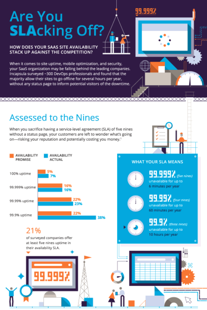
Instead of producing a short video, during which some of this data might have just flown by, the creators took a more or less standard infographic approach while adding intriguing animation throughout the asset. The design work is well executed, including a consistent branded color palette and characters in hazmat gear repairing a computer that appears to be in total meltdown mode.
Takeaway: Taking your existing infographics and adding motion is a relatively simple and straightforward way to effectively grab your audience’s attention.
3. Think You Can Out-GIF Giphy?
During the onset of the coronavirus pandemic, Giphy realized that people were turning to animated GIFs to express themselves. By taking a look at the internal data, Giphy decided to pull out some trends that might shed light on how people communicated online during this unprecedented time. The company published a blog that, taken in its totality, we could refer to as an animated infographic. Giphy had no trouble unearthing some fascinating data points.
Giphy made great use of internal data and unique skills to produce a highly resonant, engaging and shareable piece of content. The company also used standalone line graphs where relevant, proving that animation was seen as an enhancement, not just something to do for its own sake. Further, these insights are great for marketers, who are always looking for more information about how people communicate, search and share with each other.
Takeaway: Dig deep and think creatively about how you can leverage your unique strengths and internal information for a great animated infographic.
Top 3 B2C Animated Infographic Examples
From the benefits of proper fashion etiquette to the major motifs of literary classics, animated infographics have B2C appeal.
1. Breaking Bad: A Chronological Journey
In 2019, before the Breaking Bad movie “El Camino” premiered as a sequel to the popular series, Storygraph released an infographic that chronologically mapped out the entire series, including all of the major moments and characters in just 18 minutes.
The animated infographic video includes a timeline that features a white line for each character. As they move along their lines, the characters connect with each other and visit different locations — which provides a clear visual of the relationships between them and where they go on their journey. The result is a fun, engaging visual asset that helps Breaking Bad fans recall the series in a new way and also serves as an intriguing marketing tool for those who have never seen it before.
Takeaway: A timeline format can be a great way to organize information and make it easy to understand. This video proves that timelines don’t have to be boring or just for historical events — they can be a fun way of remembering anything from TV shows to novels.
2. To Be or Not To Be an Animated Infographic Video
Course Hero is a true king of content. Actually, considering that we’re about to discuss the great Shakespearean tragedy “Hamlet,” it might be wise to avoid such royal and regal analogies.
This educational resource boasts a nearly unlimited supply of free student learning aids, including a massive library of fully illustrated static infographics. On the company’s YouTube channel, many of these pieces have been translated into infographic animations to accommodate a wider range of learning styles. Note that all plot points are measured against a dramatic arc that charts rising and falling action.
Takeaway: Repurpose your own content in new forms freely and extensively. You never know who will connect more deeply with a narrated video than a still image.
3. The Annual Spotify Staple
Toward the end of each year, audiophiles of all stripes eagerly await the moment when they’ll receive a notification that Spotify Wrapped has dropped.
Every user’s unique Year in Review or Wrapped content piece resembles an interactive infographic, which of course incorporates motion, time-based elements and animated transitions. Spotify visualizes your data to tell you how much time you spend listening to music, who your top artists are and so much more. These personalized infographics lead to lots of social media shares.
Takeaway: Harnessing user data in a way your customers will appreciate can lead to customized animated infographics that have massive social media appeal.
Tips and Tools for Creating Your Own Animated Infographics
Producing animated infographics can seem like a high hurdle. Fortunately, a compelling story is more important than complicated animation techniques. The basic rules of graphic design and video production apply, but infographic animation doesn’t have to break the bank. There are several different design tools that can help you get started experimenting with this format.
How Do You Create Animated Infographics?
Design tools for making animated infographics come in a variety of different formats and functionalities. Some popular options include:
- Visme: This solution is designed to be easy for beginners while still offering advanced capabilities for experienced users.
- Animaker: This simplified tool for making videos includes easy-to-use options for creating characters and producing animation.
- Canva: This popular platform for users of all skill levels includes some animation functionality.
Working with your in-house designers and developers, or contracting a creative agency, can also help you unlock new possibilities for creating animated infographics.
As a starting point, use design ideas that align with your established brand identity. Look to your existing assets for inspiration, and try to figure out how you can make them into appealing videos of interactive infographics.
If you’re starting fresh, think creatively about your available internal data, or consider commissioning a survey related to upcoming campaigns and known customer pain points.
Animated Infographics: Who Knew Motion Could Be So Appetizing?
In today’s digital age, where attention spans are increasingly short and competition for viewership is fierce, it’s more important than ever to create visually appealing and engaging content. Infographic animation is a powerful tool that can help you stand out from the crowd and effectively communicate complex information to your audience.
Whether you choose to create a video, interactive landing page or another type of animated infographic, the key is to use animation in a way that enhances your message and helps you achieve your goals. So why not give it a try and see the impact it can have on your content?
Editor’s Note: Updated January 2023.