
Email is a great marketing tool used by many people all over the world.
As ubiquitous as this communication medium is, there are instances when an email that looks perfect to you isn’t so friendly to someone with a disability. More than one billion people have some form of disability. In some cases, those disabilities can affect how messages on the screen come across.
Modern technologies, like screen readers, magnifiers and sip-n-puff devices, help people with disabilities interact with online media. As an email marketer, though, it’s up to you to make sure that everyone who receives your email can interact with it.
Here are some great tips from the pros at Email Uplers for making your emails more accessible:
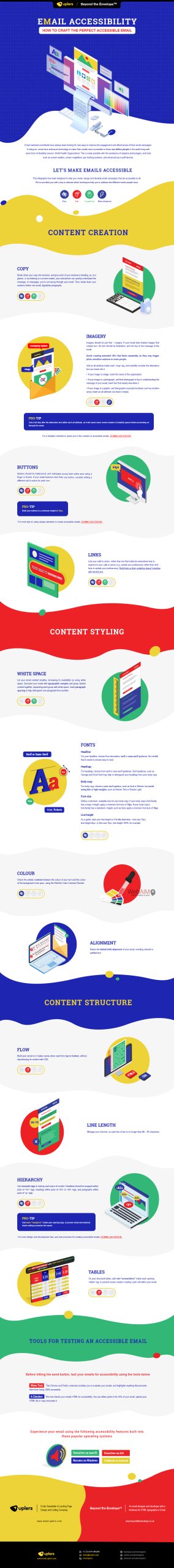 Source: How to Make Emails Accessible: Best Practices and Tools
Accommodating neurological disabilities in email
Readers with neurological disabilities may have uncomfortable or even dangerous reactions to certain types of imagery in emails. Strobing, flickering or flashing images could cause seizures among people with photoepileptic sensitivities.
Animated or blinking images should not flash more than three times per second. Additionally, flashing images should be on the smaller side and, ideally, not in red.
Section 508 of the Rehabilitation Act, §1194.22 specifically prohibits effects that flicker at frequencies between 2 and 55 Hz.
Besides being dangerous, flickering in motion graphics can cause people with vestibular disorders to feel nauseous or dizzy when viewing the email.
Making email readable for people with eye disabilities
People with vision impairment or color blindness may find poor font and color choices difficult to read.
A good font should be legible without requiring the reader to squint. Fonts that are small, thin or light in color can seemingly disappear in the background of the email.
Setting your headings apart from your body copy can make it easier to distinguish sections in your emails. An easy way to do this is choosing a serif font for headings and sans serif options for body copy.
Color contrast plays a big role in readability for everyone, but it’s especially impactful for people with color blindness. The WebAim Color Contrast Checker can help you make good color contrast choices.
Accounting for cognitive disabilities when creating emails
The way you organize your emails can impact how easy it is for readers to interact with them. Your emails should be broken into sections that are immediately distinguishable. Each section should have a heading and small paragraphs.
There should also be plenty of white space surrounding each section. Paragraph spacing separates groups of text, while typographic margins help distinguish sections.
Buttons are eye-catching and simple ways to help your readers take action. But if only the text is clickable, or if the button is too small, it’s much more difficult for people to engage with you. Keep your buttons larger than 44 px tall, and make the entire area selectable.
Test your emails before you hit send
When you create a beautiful email campaign, take a moment to test it for accessibility before sending it out to your readers. Two great tools to use are Wave Tool and A Checker.
Wave Tool is an extension for Chrome and Firefox that evaluates your email and points out any aspects that could be limiting accessibility.
A Checker checks your email’s HTML for accessibility. Either paste the URL of your email into the tool or upload the HTML file to evaluate the code.
For more helpful tips on making your emails enjoyable for your audience, check out this infographic our friends over at Email Uplers created. They know a thing or two about creating amazing email marketing campaigns.